
Great Visualization
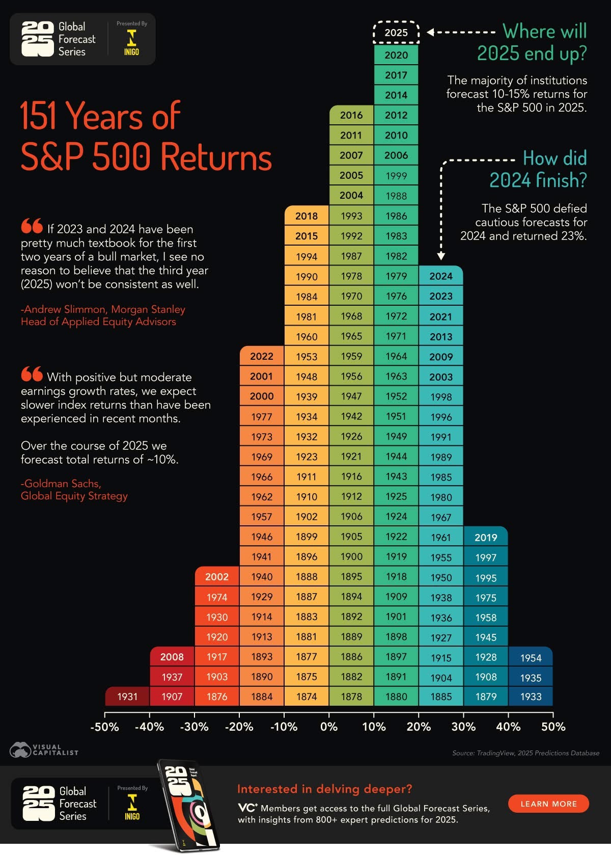
151 Years of S&P 500 Returns

Great data visualizations come in two different categories.
This is a beautiful visualization—great work by Visual Capitalist.
I teach "Data Tools and Visualization" at NKU Haile COB Graduate Programs MBA program. The course aims to influence change through effective data communication, an essential skill for any manager looking to lead through a data-driven approach.
Great visualizations come in two different categories.
1. The graph is easy to read, and the punchline is clear, so people don’t have to spend too much time on it.
2. The content is so engaging that someone will spend several minutes dissecting the data.
This graph falls into the second category, and it is simple. I spent last night just looking at it over and over.
What do you think?
I've been a fan of the visual capitalist ever since their inception but this is further proof of why.